Subject: I do like that face better.
Author:
Posted on: 2017-12-14 15:00:00 UTC
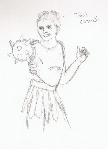
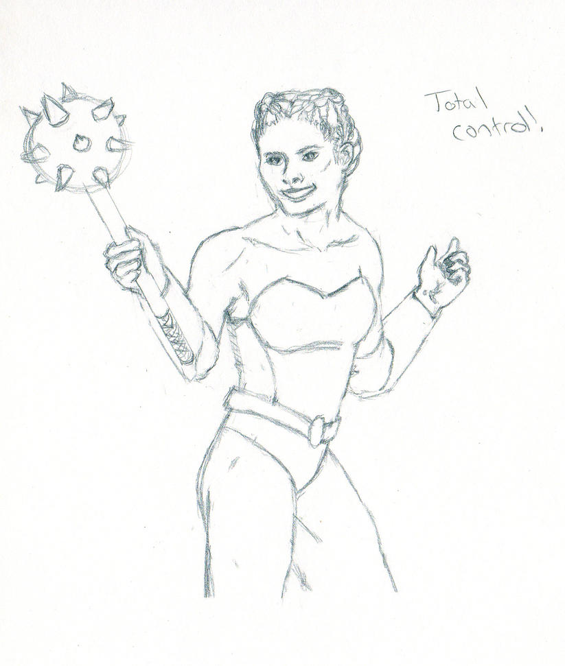
Definitely reflects the caption. {= )
On the shadows, acknowledging that this might be due to a bad scan, it looks like you went too far on the face and not far enough on the robe. Partly because the the shadow across her nose and cheek has a mottled texture, it kinda looks like a bruise. I think the others would work if I weren't distracted by that one, though. It would also help if the skin tone were more saturated to begin with. I tend to use at least three tones for skin: First, a base layer, usually light peach for a fair complexion or beige for a sallow one. Everything gets layered over and blended back into it. Second, a pink or near-red for areas of high vascularity, like the cheeks; and third, a browner shade for less vascular areas. Plus whatever looks right for lip color, pockets under the eyes, etc. For Gall, the base tone was Deco peach, the pink was blush pink (this is very aptly named and I use it a lot), and her "brown" was light peach, because she is very fair. Plus the henna, sandbar brown, and teensiest bit of indigo for shadows, and white for highlights.
Skin is complicated. Hair is, too, and I use more or less the same process to do that: soft base coat of the lightest highlight color, mid-tone, dark tone. (Except for black hair. I'm working on how to make black hair less flat.) Definitely get good pencils if you want to keep going with this.
A good point: her right sleeve looks pretty good! The shape of the shadow brings out the roundness of the cuff, and it all looks cohesive.
~Neshomeh