Subject: Okay, first of all? This is so exciting /jumps around
Author:
Posted on: 2015-06-09 15:59:00 UTC
Thank you so much for making these. Although, I've been wondering: how exactly do you make these? Is it a website/generator? Are you using Illustrator and clipart? How does this magic work?
Secondly, thank you, and hearing that these ones were fun is pretty awesome.
Third, a couple of adjustments, if you don't mind.
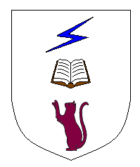
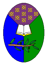
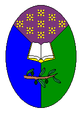
The English arms are great, especially the way the edges of the book fit the boundaries of the purple. Speaking of the purple, though, is there any way to get it less red-hued? A little more like a darker version of the purple in the Elvish arms? I think that's the only thing I want changed there.
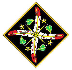
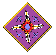
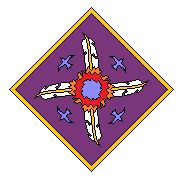
For the Elvish: also fantastic, especially the quills, and though there's no way you could have known, I like seagulls. Probably too much time around oceans as a kid :) I also like the 'flying away from the fire' touch. However, could you shrink them to about half the size? They should remain placed about where their tails currently join their bodies. And also...okay, odd request, but is it possible to change the shape of the blue flames? Or, if not, tilt it so that the wider parts line up with the birds? It, ah. I got it into my head that it looks rather a lot like a cross (one of the very fancy ones, couldn't tell you which church it belongs to or what the proper name for it is), which is exactly the imagery I don't want in my arms (no offence at all meant to anyone reading this, but...well, everything in the English arms apart from the colors can also symbolize some part of Jewish tradition, which should tell you something--or several things, really--about me. Crosses really don't figure into my personal life, and I'd rather they stayed out of my arms.) So, if it's possible to change that, I'd really appreciate it, because I can't seem to unsee the cross shape.
Apart from that...potentially darken the purple in the Elvish arms a little, to make everything else stand out a tiny bit more. I'm fairly sure that would work.
(Now you see why I didn't reply immediately--I knew I had a number of requests to make, and didn't feel like doing it on a tiny screen and with a touchscreen keyboard. But again, thank you so much for making these; they're completely worth slogging through two sets of heraldry rules in search of understanding.)
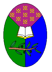
...wait, hold on. I think I must have described the English colors in the wrong order--I swear I meant for the green and the blue to be flipped. Wasn't there something about them going top, then left? No wonder I've been thinking something looked very slightly off.
Right. Remedied description:
Oval, per pall purpure, vert, azure. An open book in centre Or with pages argent, an olive branch below proper, nine sparks above Or.
And with that, I'm done. And will continue being happy about having heraldry, because it's really worth being excited about. (Case in point: saw it for the first time yesterday, and promptly walked down the hallway staring at it and smiling). Thank you again, so much.
~DF
PS: Out of curiosity, would outlining the birds in black have helped at all?


