Tragedy! Crisis! Other exclamations of dismay! Once again, many of the Citizens and Knights of the Union of Plort have not received their customary honours. Their names are not listed in Baron Huinesoron’s Cyclopaedia; their coats of arms go unblazoned; their histories are unknown to even those closest to them. Clearly, this cannot go on.
Or, in other words:
Welcome back to Konti-Nyuum.
The Protectorate of Plort, Konti-Nyuum, is not a PPC AU. Rather, it’s a PPC Community AU - an answer to a question that was never asked:
What if the PPC Community was a medieval nation?
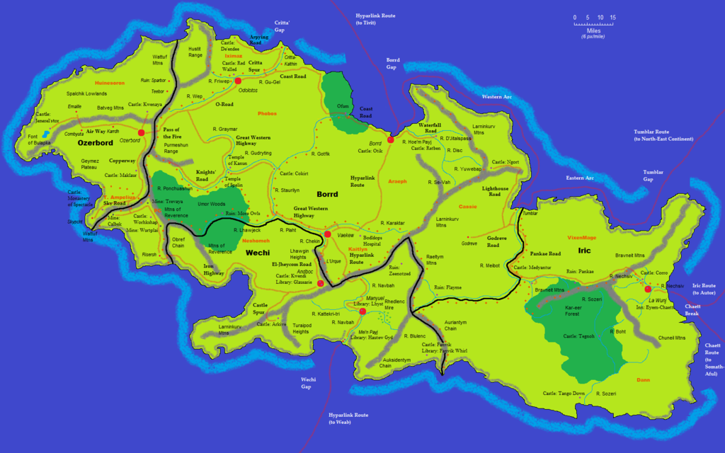
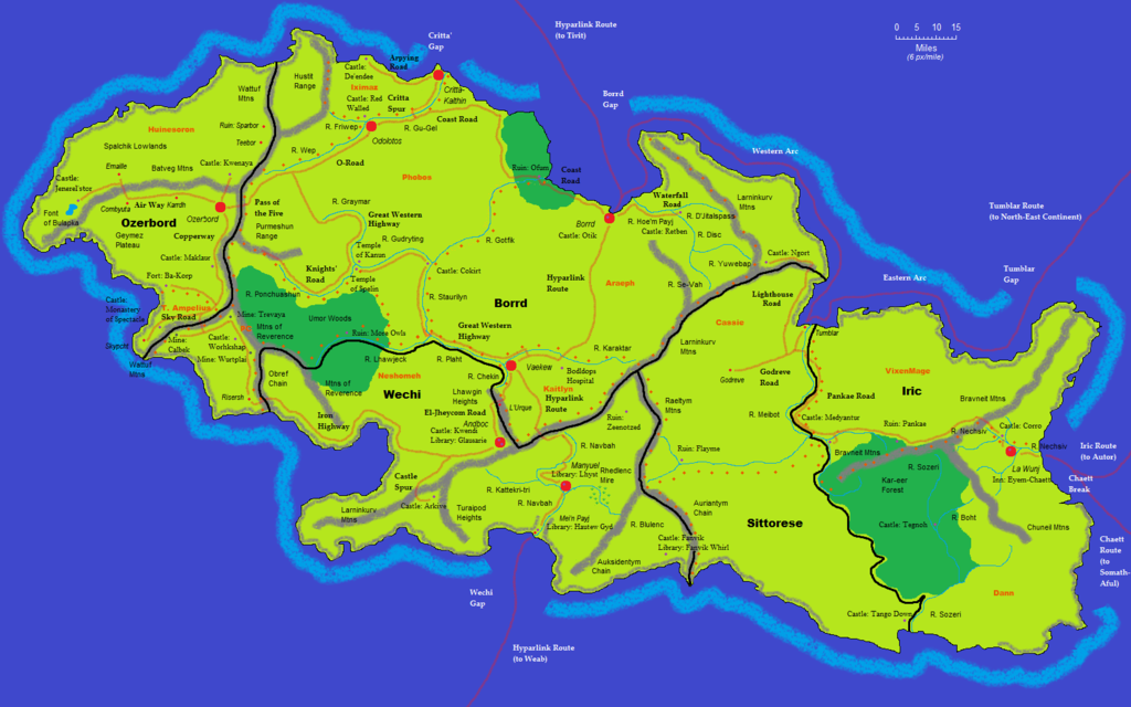
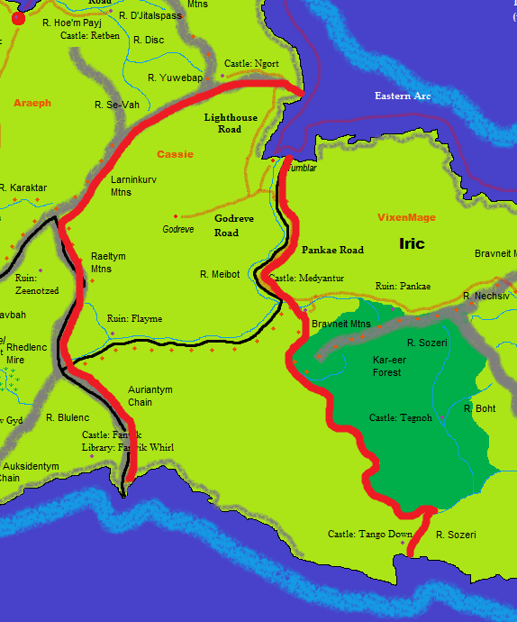
So here we are. The island of Konti-Nyuum lies to the north of the great continent of Weab. On this cliff-walled rock the noble knights Jay and Acacia made their home, building the Protectorate of Plort, and those who came after them have carried the Protectorate through its trials and troubles to the current Union of Plort. The Knights of Plort sally ever forth against the hosts of the Marizu, seeking to defend the beleaguered nations of the Scholars’ Empire from their scourge.
If you've been to Plort before, there are a few changes this year - and a few new goodies. ^^
-<a href="http://plort.wikia.com/wiki/ProtectorateofPlortWikia">The Cyclopaedia has a Wiki! This exchanges the impossible-to-search Google Doc version with an impossible-to-browse Wiki; whether you think that's a good change is up to you. Almost everything from the old version is in there, and I'll be filling in the last bits (mostly departed barons) as time passes.
-The world map has been created - and tweaked. Notably, the Scholars' Empire is now on Weab, not sequestered away somewhere. The Marizu League is attacking it directly. The Scholars' Empire represents the positive side of fandom, while the Marizu are the negative side.
There is also another known nation of the Western Continent, which - like the So Shall Medea - is making incursions into Weab. This is Guggle, and it has already taken over Yu'Tub. Not that everyone thinks it's a bad thing - the folk of Godreve and the farms along the Gu-Gel river are quite enamoured with it.
-You can visit Plort! I've made versions of Konti-Nyuum in Minecraft and in Civilisation IV; go wild. (The Minecraft version should start you off in Otik; if it dumps you somewhere else, please let me know and I'll try to fix it.)
Each and every member of the PPC Community is also a resident of Plort. You can find the autobiographies of everyone who's done this before in the WikiCyclopaedia (
mine is here, for example). If you haven't already written your history, why not join in and give one? There's a
guide on doing so on the CycloWiki, and a
glossary outlining most of the websites and fandoms in the setting.
For entertainment value, please post your bios here on the Board; if you want to cross-post them to the Cyclopaedia, go ahead, but I'm happy to sort that out for you. A couple of notes:
-Make sure to choose which of the four nations of the Union you live in, and indeed where in it; there’s nothing wrong with adding small towns and villages wherever you please, or you can live in the cities. Up to you!
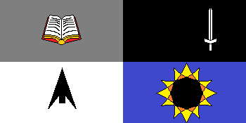
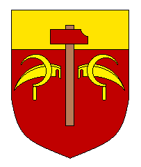
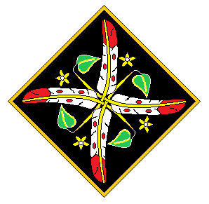
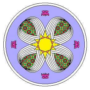
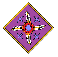
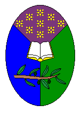
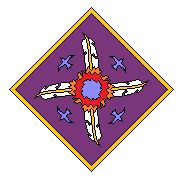
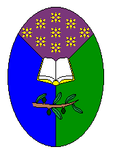
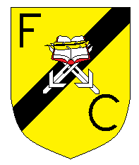
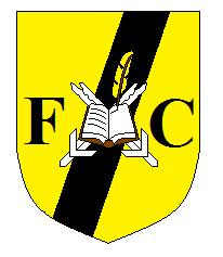
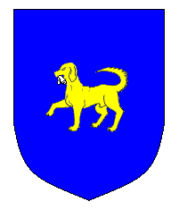
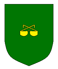
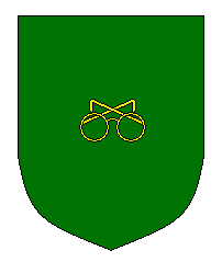
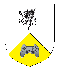
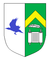
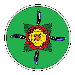
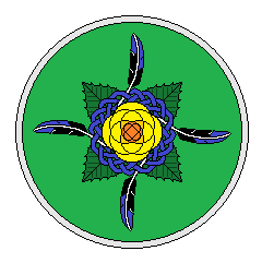
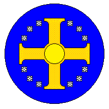
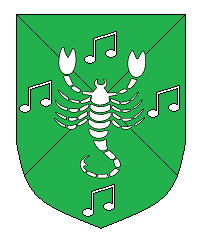
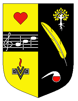
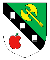
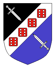
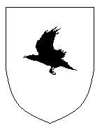
-Everyone can have their own pair of heraldic devices, according to Plort’s two systems as
described here. If you can describe your device/s, either formally as described there or just vaguely, I’ll (try to) make it for you.
Nor is this thread limited to bios and heraldry. Anything goes! There will be a Baronial Council going on, which is open for in-character comments by all and sundry; world-building, RP-subthreads, songwriting... anything goes. Basically, use your imaginations - you're good at that!
hS Huinesoron, by the grace of Kanun Baron and Knight of Plort, Protector of Ozerbord, Custodian of Fanvik-Whirl, Marshal of the Order of Udisc, Scourge of the Marizu, Friend of Medellurth, &c &c &c


